|
|
Post by Shinigami Ryuk on Jul 22, 2005 1:04:08 GMT
I just uploaded a new template to my forum and I would like your comments/opinions. The link is in the signature image.
|
|
|
|
Post by sjt on Jul 22, 2005 12:28:49 GMT
That is such a nice forum, all brillaint, maybe a PM bar but really 9 and a half out of 10!
|
|
|
|
Post by Shinigami Ryuk on Jul 22, 2005 23:15:45 GMT
Thanks.
I'm working on the PM bar. I had one for my board but it became outdated once Proboards was upgraded.
|
|
|
|
Post by Shinigami Ryuk on Jul 28, 2005 13:51:37 GMT
bump
|
|
|
|
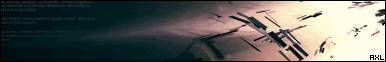
Post by AXL on Jul 28, 2005 15:21:40 GMT
I think it looks good, there a few broken links in the affilate you might wanna get rid of and a few pointless boards with no posts or one post like the card games board.
You also might wanna colour code your staff, it helps alot when a new member or a guest has a quiery.
I think the grads look nice but the banner doesn't really apeal to me, you might wanna change it
|
|
|
|
Post by Shinigami Ryuk on Jul 28, 2005 18:57:07 GMT
The banner doesn't appeal to you? Wow. You're the first. I have been getting a ton of rate at PBS saying they love the banner. I'm shocked, honestly.
I'm trying to figure out a good color code for the staff.
Thanks for your input, though.
|
|
|
|
Post by AXL on Jul 28, 2005 19:00:56 GMT
lol i just think it looks abit.....plain, not much goin on. But im glad i could help  |
|
|
|
Post by Shinigami Ryuk on Aug 9, 2005 12:40:30 GMT
Again, thank you.
|
|
|
|
Post by Marko on Aug 11, 2005 14:36:50 GMT
EDIT: IM AN IDIOT, NEXT TIME I WANT TO ADVERTISE, I WILL JOIN UP AND MAKE MY OWN THREAD
|
|
|
|
Post by Dark Messenger on Aug 11, 2005 18:47:42 GMT
if that was your own template, id Give it 9/10, but since its not... well yea..
however the skin suits the theme of your forum..
|
|
|
|
Post by Shinigami Ryuk on Aug 12, 2005 0:29:30 GMT
Thank you. You just reminded me that I need to go back to some of those design forums and post. Thanks DM.
|
|